A (Brand) New Look

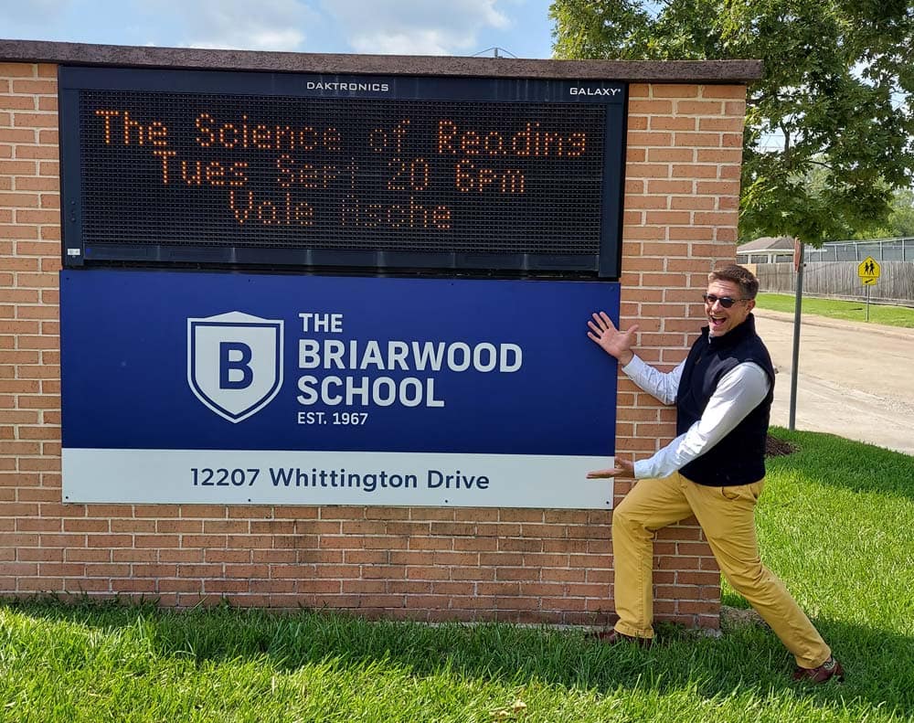
As part of honoring Briarwood’s past while looking to the future, you may have noticed our updated brand.
We are thrilled to introduce the final product and incorporate the new consistent brand into various aspects of student, faculty, and parent life, both on and off campus. To shed light on the brand implementation process, I would like to explain how we arrived at this point.
Finding the right professional partner was the first and most crucial step in this process. After careful consideration, we decided to work with Primer Grey, a small branding agency based in Houston that has an impressive 13-year track record of working with small businesses and nonprofits. Although the process was arduous, it was also enlightening, and we learned a lot from our partnership with the team at Primer Grey.
Our school has a rich history, and the approach taken by the design team was to fully understand our background and culture before creating anything. Members of the administration and teaching staff from both Briarwood and Tuttle put in hours of work to discuss our history, perceptions, communication, and goals for the future.
Throughout the process, we learned that both schools are crucial to each other while remaining unique entities. This realization influenced Primer Grey’s brand approach, as we understood that there needs to be a balance between individual identities and unity as a whole. Our goal was to create more distinctive identities for each school while maintaining a consistent look for Briarwood.
It’s worth noting that the original school colors have been retained. However, instead of using blue and red to represent both schools, they were separated to give each school its own unique identity. Briarwood was assigned the blue color, while Tuttle was assigned the red color to emphasize the idea of unity and cohesion.
After updating our school’s mascot, the beloved mustang, we aimed to make it more distinctive from other area schools using the same style mascot. We incorporated crests into the brand to give it a more academic feel, drawing inspiration from the logos of prestigious universities. The final result is a balance of classic academic motifs and modern design elements, which perfectly represents our approach of embracing the past while moving towards a bright and prosperous future.

